 As I mentioned last month, if we want our photography to look like art, we need to study art. I find that the more I learn about composition and design, the better my pictures turn out. Here are a few more things to consider when looking through your viewfinder.
Balance
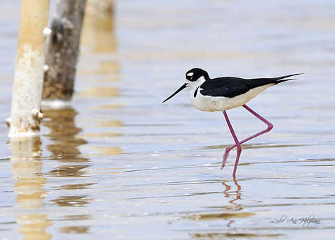
Objects in a photograph have visual weight to them. Imagine that your photo is a seesaw, supported by a point in the middle. For example, a large, black crow to the right of the picture will tend to pull that side downward unless balanced by something else on the left side. Just as with actual weights, two or three smaller objects can balance one big one. Most pleasing pictures are visually balanced. Remember that a large open space can also have weight, so you don’t need clutter your composition.

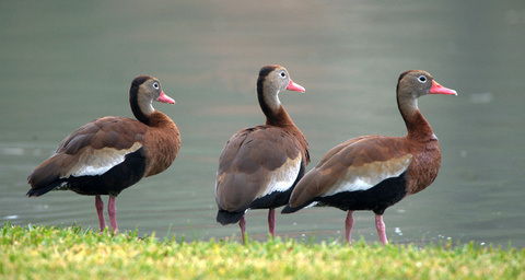
Artists have noticed that our brains are happier looking at images that contain an odd number of items. This seems connected to the idea of balance. Whatever the reason, a photo of three (or five) birds (or flowers, or motorcycles, or…) just feels “right” somehow. See what I mean?
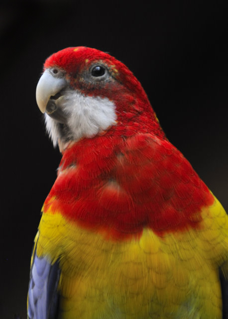
 Color
Color
With many species of birds, the first thing we notice is their color. Wood Ducks, Painted Buntings, and breeding male House Finches catch our attention because of their flamboyant plumage. When photographing a particularly colorful bird, it’s important to consider what the colors are and how we can show them off to best effect.
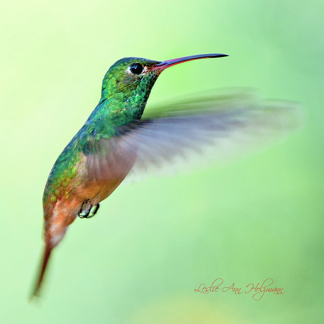
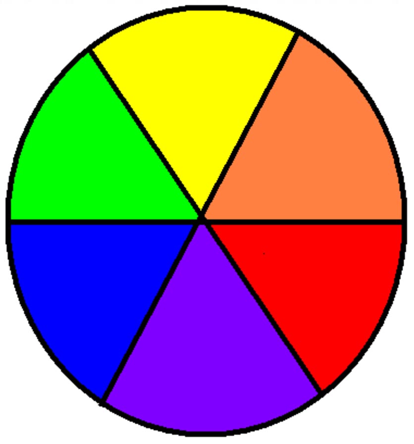 Take a familiar color wheel. Colors may be adjacent to, or opposite, one another. In this photo of a Buff-bellied Hummingbird, the yellow, green, and orange are all on the same side of the wheel. Similarly, the blues and greens of the Steller’s Jay photo are harmonious. The result is a soft, relaxing feeling.

 On the other hand, we may aim for opposite colors, which make the photo seem more vibrant. Placing a red bird against green foliage, or an orange and yellow bird against a blue sky, such as this Western Tanager, makes those colors seem to pop.
Saturation is another concern when it comes to color. While we all enjoy bright colors, there’s a current trend towards blatant over-saturation. I think it looks tawdry and artificial, and prefer to keep things natural-looking, adjusting the saturation of my photos to match what I actually saw in the field. Just because you can make it more intense doesn’t mean you should.
That’s enough for now. Again, I strongly suggest you grab your camera and go put these principles into practice. Be intentional and learn how they work for you. I’d love to see your results!
